Wren Kowalczyk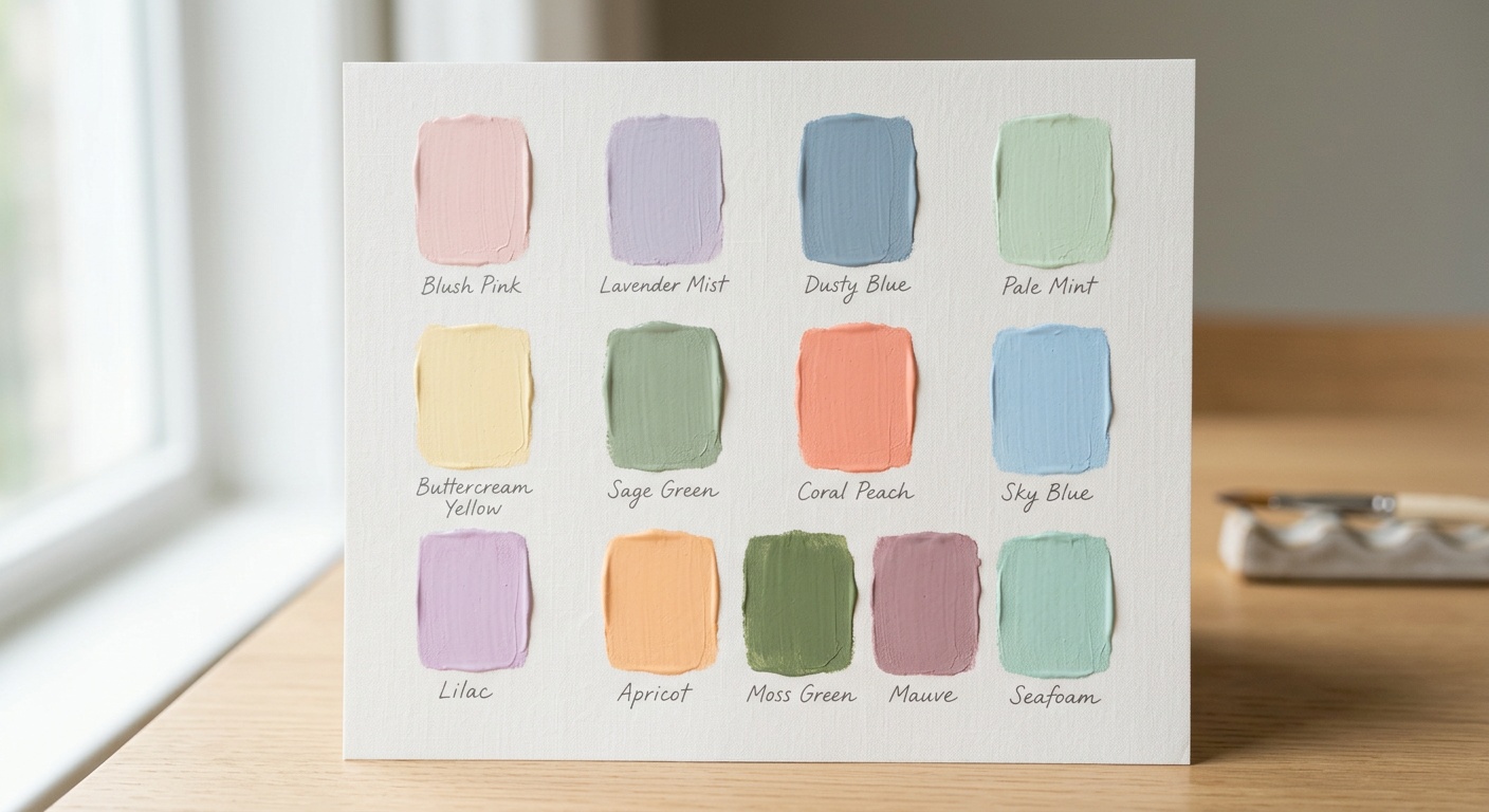
Choosing Calming Interior Paint Colors for a Minimalist House
Reading time: 8 minutes
Ever stood in a paint aisle, swatches fanned out like a losing hand of cards, wondering why “Whisper Gray” and “Quiet Fog” look identical yet cost different amounts of your sanity to choose between? You’re not alone. In 2026, with remote work still shaping nearly 34% of household routines according to recent workplace surveys, the color on your walls has become more than decoration—it’s a daily mood regulator.
Let’s break down how to select calming paint colors that actually support a minimalist aesthetic, without falling into the trap of sterile, lifeless rooms.
Table of Contents
- Why Color Psychology Matters More in Minimalist Spaces
- The Core Palette: Where to Start
- Practical Roadmap for Choosing Your Colors
- Common Challenges and How to Fix Them
- Comparing Popular Calming Shades
- FAQs
- Your Roadmap Forward
Why Color Psychology Matters More in Minimalist Spaces
Minimalism strips away visual noise—furniture, clutter, ornamentation—which means every remaining element, especially wall color, carries more psychological weight. A 2025 study from the Color Marketing Group found that 68% of homeowners reported feeling “more mentally settled” in spaces using muted, low-saturation palettes compared to high-contrast or bold color schemes.
Here’s the straight talk: in a maximalist room, a jarring color gets absorbed by pattern and texture elsewhere. In a minimalist room, that same color becomes the entire conversation. There’s nowhere for the eye—or the nervous system—to hide.
The Science Behind Calm
Color psychologist Dr. Angela Wright has long argued that “color is a language, and rooms speak whether we intend them to or not.” Cooler tones (soft blues, sage greens) tend to lower heart rate slightly, while warm neutrals (oatmeal, clay) create a grounded, cozy sensation without visual clutter. Neither is “correct”—it depends on how you want a room to function.
Light, Orientation, and Undertones
A calming color in a north-facing room can look flat and cold; that same shade in a south-facing room might feel warm and inviting. Before committing to any paint, test swatches at three times of day: morning, midday, and evening. Undertones—the sneaky green in a “gray,” or the pink in a “white”—reveal themselves under different light conditions.
The Core Palette: Where to Start
Quick Scenario: Imagine you’re repainting a compact 800-square-foot minimalist apartment. You want it to feel spacious, serene, and cohesive room to room. Where do you begin?
Start with a foundation of three to four related neutrals rather than picking one shade per room in isolation. This creates flow and prevents the “patchwork” feeling that undermines minimalist design.
- Warm neutrals: Soft greige, oat, and putty tones that avoid feeling clinical.
- Cool neutrals: Pale dove gray, soft stone, and muted taupe for a more contemporary edge.
- Nature-inspired accents: Muted sage, dusty blue, or clay—used sparingly on a single accent wall or in an adjoining room.
- Grounding darks: Deep charcoal or espresso brown for trim, doors, or a single feature wall to add depth without visual chaos.
Case Study: The Helsinki Apartment Reset
In early 2026, interior designer Liisa Korhonen documented a renovation of a 1970s Helsinki apartment for a client experiencing chronic work stress. The original palette was stark white throughout—technically minimalist, but clients reported the space felt “sharp” and “unwelcoming.” Korhonen replaced the pure white with a warm oat neutral (roughly 85% reflectance, slight yellow undertone) and added a single sage accent wall in the bedroom. Post-renovation surveys showed the client’s self-reported stress levels dropped noticeably within the first month, and she described the home as “finally exhaling.”
Practical Roadmap for Choosing Your Colors
- Audit your natural light first. Track sunlight patterns for at least two days before buying paint.
- Choose one dominant neutral for 70% of your walls. This is your calming base.
- Select one or two supporting tones for accent walls, doors, or trim—no more than three colors total per open floor plan.
- Test large swatches—at least 2×2 feet—on multiple walls, not just one.
- Consider finish, not just color. Matte and eggshell finishes reduce glare and feel softer than satin or gloss, reinforcing calm.
Common Challenges and How to Fix Them
Challenge One: Rooms Feel Cold Instead of Calm
This usually happens when cool grays are chosen without checking undertones. Fix: swap to a “warm gray” with beige or taupe undertones, or add warm-toned wood furniture and textiles to balance the wall color.
Challenge Two: Everything Looks Too Similar and Flat
Minimalism doesn’t mean monochrome monotony. Fix: introduce subtle tonal variation—use a slightly darker shade of the same color family on one wall or the ceiling to create depth without breaking the calm aesthetic.
Challenge Three: Paint Looks Different Than the Swatch
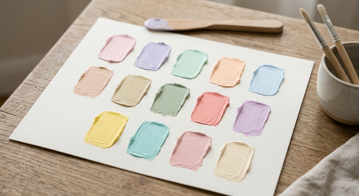
Lighting, screen calibration, and store lighting all distort color perception. Fix: always buy a sample pot and paint a poster-board section you can move around the room to test in different light conditions before committing to gallons.
Comparing Popular Calming Shades
| Color Family | Best For | Light Reflectance Value | Mood Effect | Pairs Well With |
|---|---|---|---|---|
| Soft Sage | Bedrooms, reading nooks | 55-65% | Grounded, restorative | Oak wood, linen textiles |
| Warm Greige | Living rooms, hallways | 70-80% | Balanced, versatile | Black metal accents |
| Dusty Blue | Home offices, bathrooms | 50-60% | Focused, serene | White ceramics |
| Oat Neutral | Open-plan spaces | 80-88% | Warm, welcoming | Terracotta, rattan |
| Charcoal Accent | Feature walls, trim | 10-15% | Grounding, dramatic-calm | Brass, warm wood tones |
Reader Preference Snapshot: 2026 Survey Data
A 2026 consumer paint survey of 1,200 homeowners undergoing minimalist renovations asked which calming color family they chose as their primary wall color. Here’s how preferences broke down:
Pro Tip: Notice how warm tones dominate. Even in minimalist homes prioritizing simplicity, homeowners are consistently choosing warmth over stark coolness—confirming that “calm” doesn’t mean “cold.”
FAQs
Is white still considered a good minimalist color in 2026?
Pure white has fallen out of favor for whole-room applications because it can feel clinical and amplify glare. Designers now recommend “soft white” or “warm white” variants with subtle undertones, reserving stark white for trim or accents only.
How many colors should a minimalist home use total?
Most designers recommend three to five colors across an entire home, including neutrals and one or two accent tones. This keeps visual flow consistent while avoiding monotony.
Should ceilings match the walls in a minimalist space?
Not necessarily. A ceiling one or two shades lighter than the walls often makes a room feel taller and airier, which supports the calm, uncluttered feeling minimalism aims for.
Your Roadmap Forward: Painting With Intention
Choosing calming colors for a minimalist home isn’t about chasing trends—it’s about understanding how light, undertone, and psychology interact in your specific space. As remote living and wellness-focused design continue shaping home renovation choices through 2027, expect even more homeowners to prioritize mood-supportive palettes over purely aesthetic ones.
- Step 1: Map your natural light before buying a single can of paint.
- Step 2: Commit to one dominant warm or cool neutral as your foundation.
- Step 3: Add no more than two supporting tones for accents and depth.
- Step 4: Test large swatches across multiple days and lighting conditions.
- Step 5: Choose matte or eggshell finishes to soften light reflection.
Your walls are the quiet backdrop to every stressful call, every slow morning coffee, every deep breath after a long day. So here’s the real question worth sitting with: what does your home sound like when it’s not saying anything at all—and is that the calm you actually want to come home to?